Blocks & customization
Barbican's atomic blocks and the three layers of customization — configuration, native style controls, and CSS hooks.
Blocks are the atomic layer — the pieces everything else is built from. Barbican breaks the public site into small, single-purpose blocks: an office address, a row of social links, a phone list, a photo gallery, a listing headline, the composable spec, a listing card, and dozens more. Each one is individually insertable, re-orderable, and removable, and each renders itself from your RESO data.
This is the philosophy that sets Barbican apart: we give you building blocks, not a black box. Other approaches hand you a rigid shortcode that renders a fixed layout you can’t get inside of. Barbican hands you the pieces and gets out of the way — you assemble and style them however you like, with complete control over the result and without ever editing the plugin. All of Barbican’s blocks live under a Barbican category in the block inserter.
The three layers of customization
Section titled “The three layers of customization”Every block can be tailored at three levels, each a fallback for the one before. Reach for the simplest that does the job.
Layer 1 — Block configuration
Section titled “Layer 1 — Block configuration”The controls Barbican provides for each block, in the editor’s block inspector. These are the purpose-built knobs — things generic blocks don’t have. Depending on the block, they include:
- A Header toggle and label — show or hide the section’s heading and rename it.
- A Brand accent colour — the block’s highlight (icons, pills, links).
- Per-field visibility — on the listing card and headline, toggle beds, baths, area, the price-drop badge, and status chips on or off; on the Profile fields and the property spec, choose the column count and hide any group or field.
Select a block, open the inspector’s Settings tab (the gear), and set these — no code.
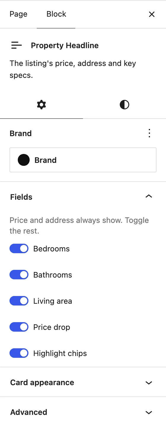
The two icons below the block name are the inspector’s tabs: the gear (Settings) holds these Barbican controls and, under Advanced, the CSS-class field (layer 3); the half-circle (Styles) holds the native style controls (layer 2, next).
Layer 2 — Style & layout controls
Section titled “Layer 2 — Style & layout controls”The standard WordPress controls that come out of the box with every Barbican block. Because each block declares support for them, you get, with no configuration:
- Colour — text and background.
- Typography — font size and line height.
- Dimensions — margin and padding.
These are the same controls you use on any core WordPress block, in the same place in the inspector. Nothing Barbican-specific to learn.
Layer 3 — CSS hooks (the escape hatch)
Section titled “Layer 3 — CSS hooks (the escape hatch)”When the first two layers don’t get you all the way, every part of every block
carries a documented CSS class you can target from your own stylesheet. The
classes follow the BEM convention and are all namespaced with the barbican-
prefix — the same prefix the rendered HTML uses — so they never collide with your
theme or another plugin:
barbican-<block> /* the block root */barbican-<block>__<part> /* a part of the block */barbican-<block>__<part>--<variant> /* a variant of a part */For example, to make the social-link tiles perfectly round:
.barbican-social__icon { border-radius: 50%; }The full class list for each block is in the Block Reference.
This layer needs no plugin code and no template editing — the Additional CSS class(es) field and the site’s Additional CSS panel both ship with WordPress, so the interface for hooking in is already there. Barbican’s job is simply to provide stable, documented classes to hook into — which it does, for every block.
Recolour everything at once
Section titled “Recolour everything at once”Before targeting an individual hook, know that the blocks derive their chrome — text, muted labels, hairlines, surfaces, and the accent — from a few custom properties. Set these once and the whole public site recolours together:
| Property | Role |
|---|---|
--barbican-brand |
Your accent colour (also set per-block as the Brand control) |
--barbican-fg |
Foreground / text colour |
--barbican-bg |
Background colour |
--barbican-muted, --barbican-faint, --barbican-hairline, --barbican-surface |
Derived greys — override to fine-tune |
Where to add your CSS
Section titled “Where to add your CSS”-
Go to Appearance → Editor → Styles, open the ⋮ menu, and choose Additional CSS — or add the rules to your theme’s stylesheet.
-
Write rules against the
barbican-hooks (or set the--barbican-*properties on.barbican-rootto recolour everything). -
To scope CSS to a single placement instead of every instance of a block, add your own class in that block’s Advanced → Additional CSS class(es) field and target that.
That’s the whole stack: a theme for the frame, navigation to move through it, pages assembled from patterns, and these blocks as the pieces — each tunable at three levels.
For the per-block details — every block’s controls and its full list of CSS hooks — continue to the Block Reference.